Twenty-five years after its launch, e-commerce company LesPAC continues to expand its prospects. Attuned to its users, modern and always innovative, LesPAC is hard at work on fulfilling its vision of being the most relevant online platform in its industry – and now 100% free of charge for its users.
Today, LesPAC wishes to increase its visibility in Quebec’s population and communicate the fact that its platform is now entirely complimentary.

The mandate
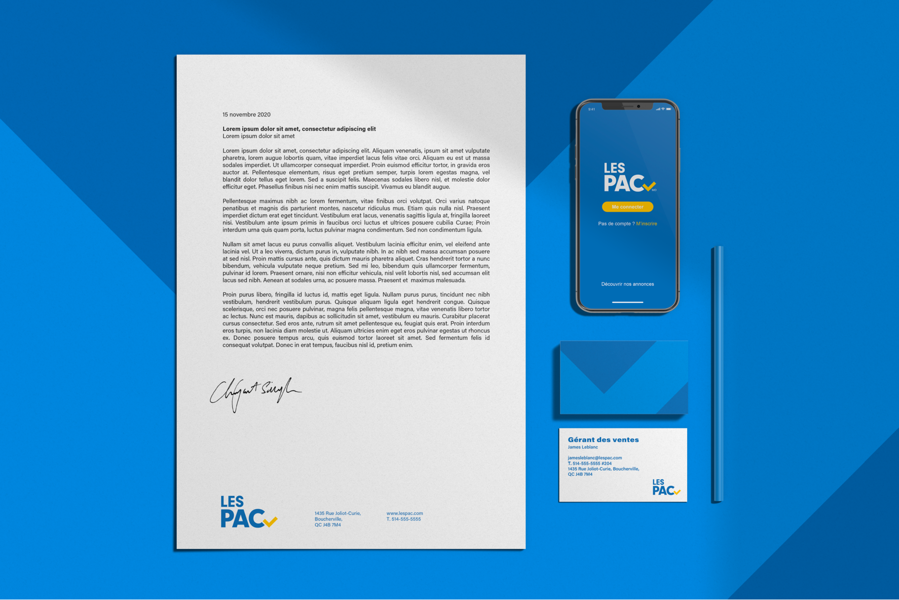
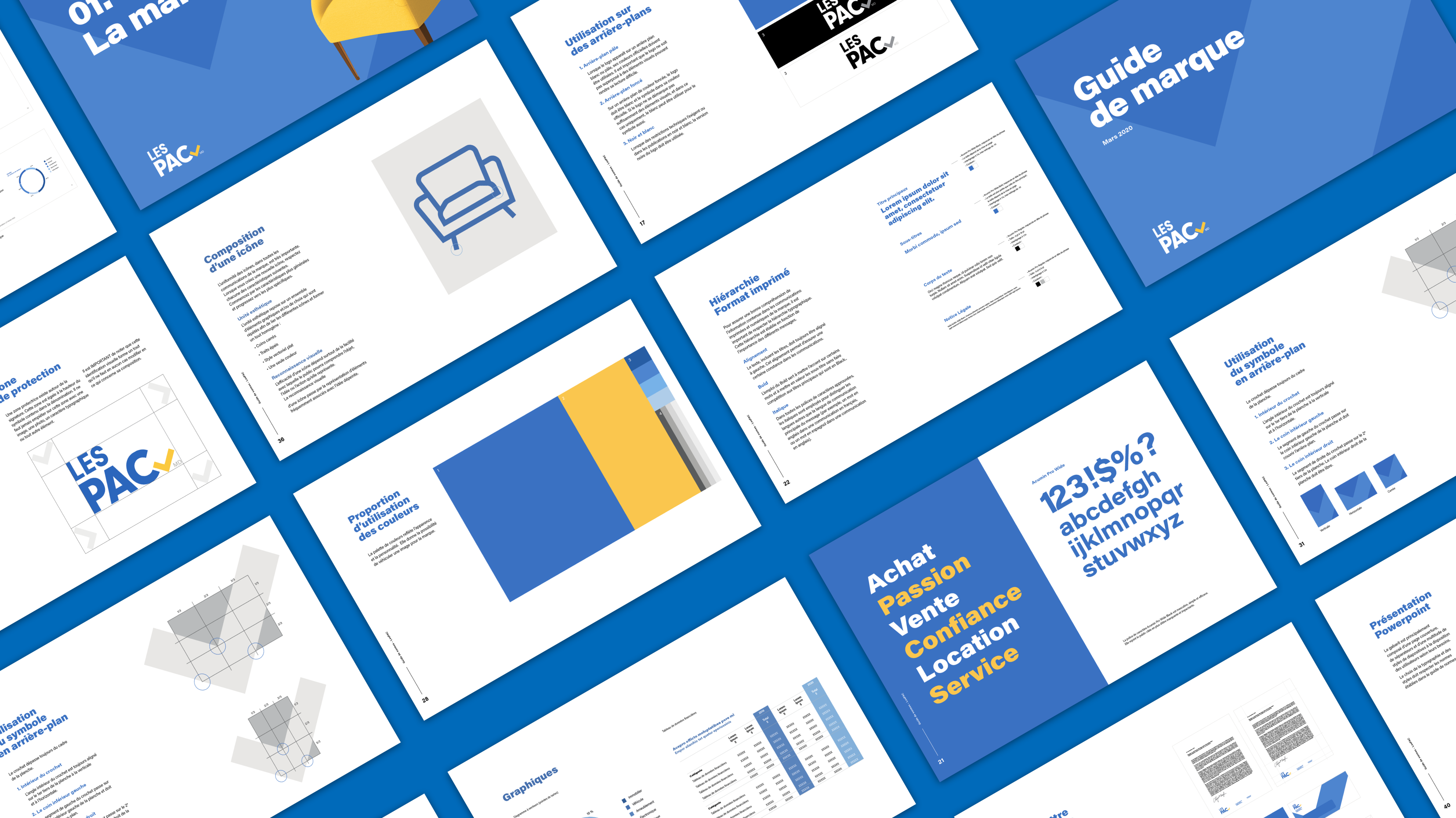
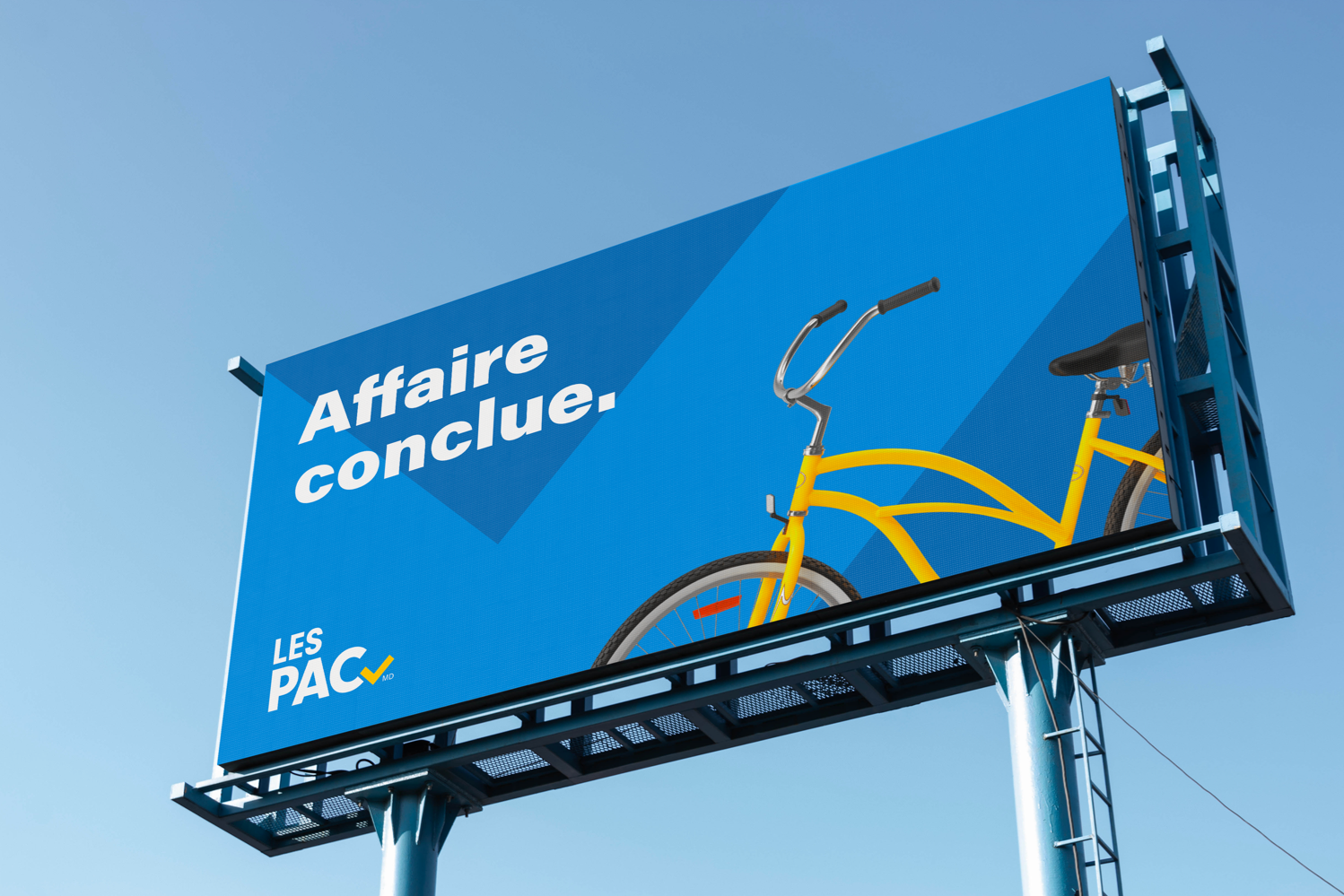
To modernize the brand’s visual identity, by creating, among other things, a new logo, and to develop an advertising campaign that easily lends itself to various outlets.
The goals
We were mandated to design a visual identity that takes into account the brand’s existing equity, while at the same time demonstrating a clear shift forward. Furthermore, we had to communicate the fact that the platform is now 100% free of charge for (private) individual vendors. Lastly, the goal was to promote the fact that vendors can reap the rewards of having access to serious buyers on the LesPAC platform, which provides a user-friendly and pleasant experience.
The inspiration
In order to create a symbol that inspires confidence and curiosity among consumers, LesPAC’s new visual identity needed to be revamped, credible and accessible. Aligned with the company’s current vision, this new identity served as a pillar for creating the advertising campaign highlighting the brand’s confident, devoted and authentic personality.
The idea
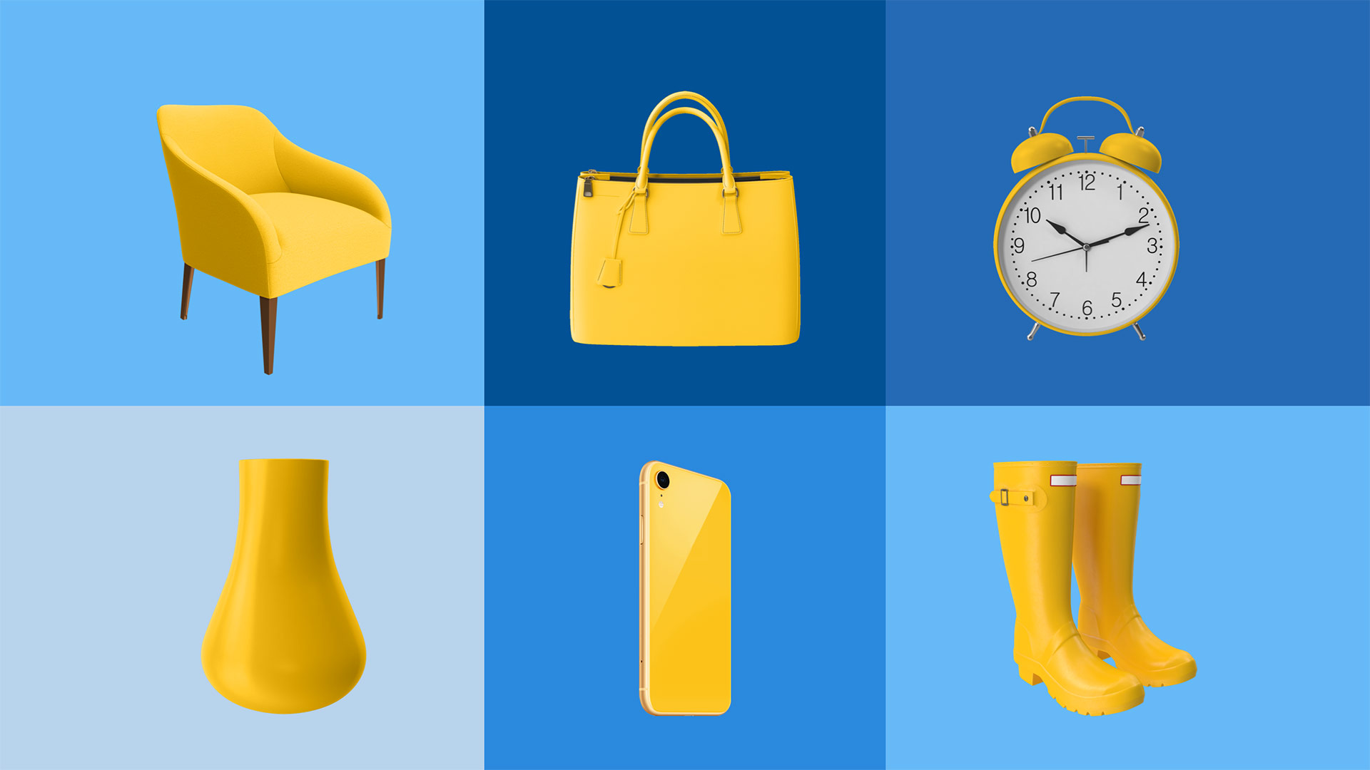
LesPAC’s new logo, adorned with a checkmark in its lower right corner, puts forward the brand’s seriousness. It speaks to users who are looking to get “straight to the point”, i.e., to conclude sales in beautiful simplicity.

To give even more depth to LesPAC’s new image, a two-part signature sound was developed – for the TV campaign and the mobile app’s notifications.
The advertising campaign emphasized the platform’s users by displaying pictures of LesPAC vendors and buyers like they were putting themselves up for sale on the site. This proved that beyond the objects available on the LesPAC site, what is actually on offer is a serious and solid client base.
Similar realisations
-
Read more
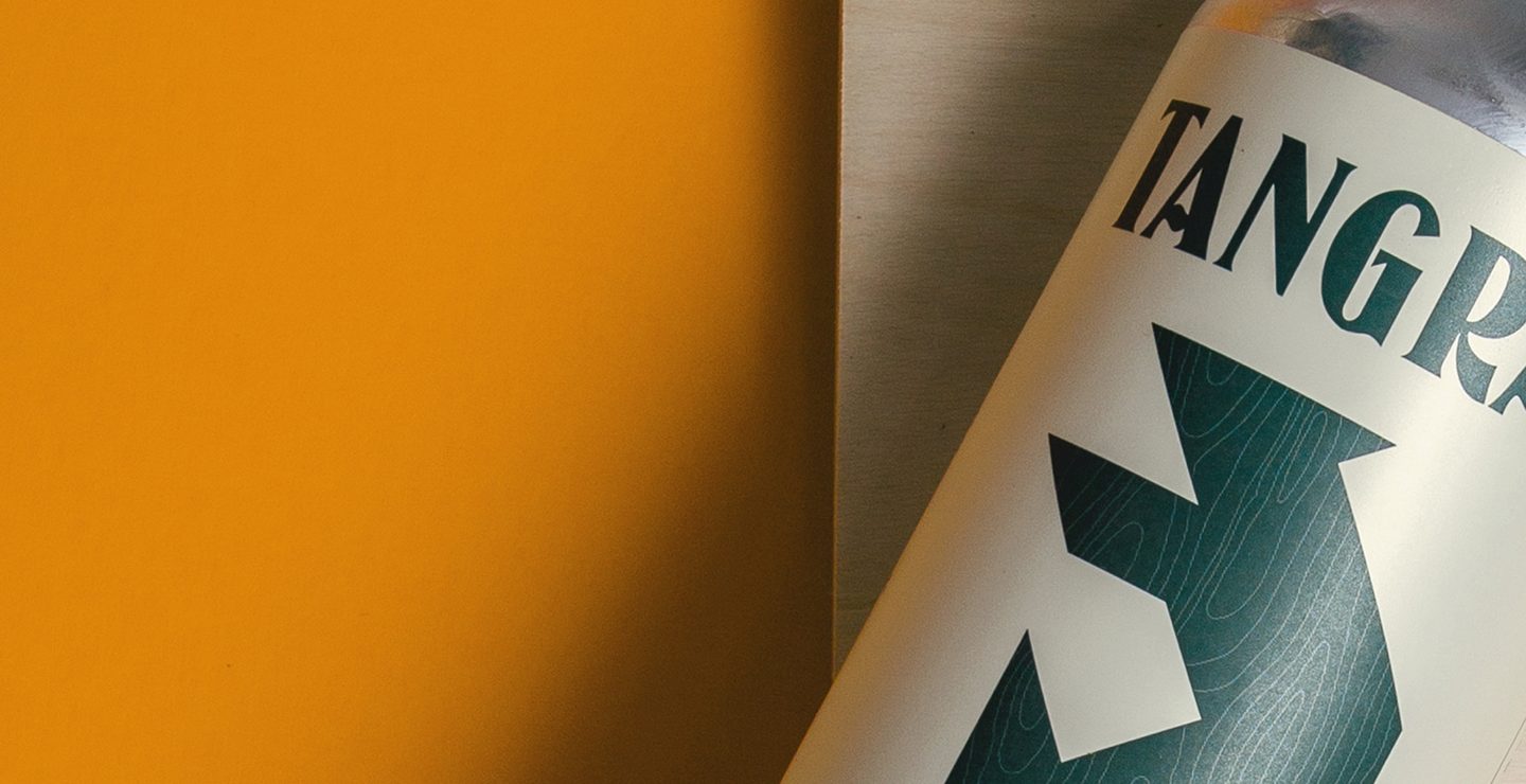

Beer in all its forms
A new addition to the Collectif Brassicole Ensemble, which includes the labels Loop, Boldwin, Des Cantons and Vagabond, the Tangram Brewing Company needed to avail itself of a brand identity that would set it apart within the highly competitive landscape of Quebec’s microbreweries.
Branding and design, Digital -
Read more

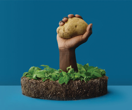
« L’Épatante patate »
For the past 13 years, Archipel has worked with Quebec’s association of potato packers and producers, the AEPTQ, to defend the “helluva” potato’s place at our tables.
The new annual campaign reconnected with the known signature, « C’est plate pas de patate » with the objective of giving the beloved spud a younger, more up-to-date image. Back by popular demand, messages were voiced by the anything-but-boring Katherine Levac to reach out to young adults.
Advertising